If you are having issues with Gutenberg editor, please simply download official Classic editor plugin.
Haven't found you're looking for? Visit goodstore howto web
Checkout Page Layout Fix
-
Hi there,
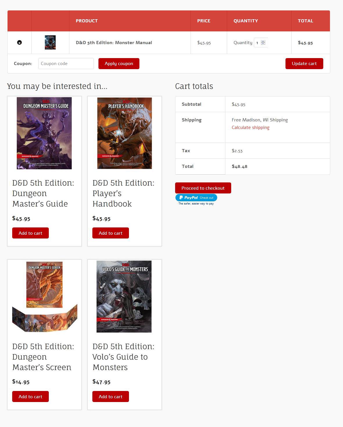
On the desktop view of the GoodStore theme, the layout for the Checkout Page looks kind of bad. The Cart Totals are pushed way down the page, forcing the end-user to have to scroll down to see the totals. The element that's doing this is the YMAL/Upsell items. I've attached 3 screen shots here.
1. GoodStore Checkout Layout CURRENT.jpg: This shows what the current layout looks like.
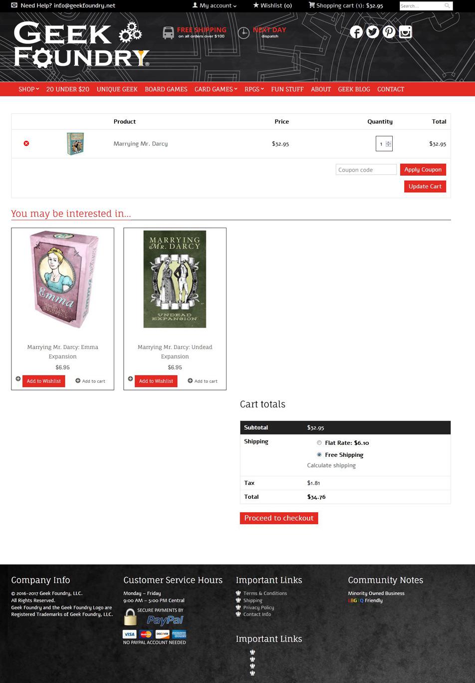
2. For The Cause Checkout Layout.jpg: This is a really clean, well-aligned checkout page from a theme called "For The Cause"--this is a reference source for what I would like GoodStore checkout to look like with respect to how the elements are displayed.
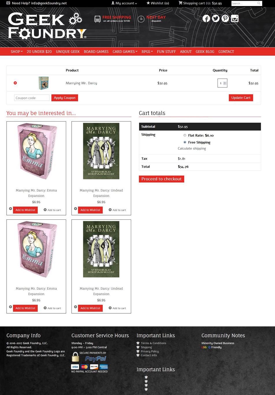
3. GoodStore GOAL.jpg: This is a mockup of the GoodStore theme made to look like the For The Cause checkout. Again, I would like to have the checkout page look like this mockup.
Any help getting the checkout page cleaned up to look like #2/#3 would be appreciated.
Thank you!
-Efrem


All following comments are shown for registered users only!
Howdy, Stranger!
It looks like you're new here. If you want to get involved, click one of these buttons!
Categories
- All Discussions3,928
- GDN Theme417
- GoodStore3,231
- JaWesome83
- FlyingNews190
- ImageFetcher7
Powered by Vanilla Copyright 2017 jawtemplates.com Wordpress Themes Studio


